Legibility
The legibility of the map is the overall problem that needs to be solved. Therefore, a proposal on a new Specification must be preceded by extensive tests which will properly test the legibility. With respect to the partially-sighted, the symbols on maps at scale 1:10,000 must still be enlarged to 150 percent. But a general overhaul of the dimensions of symbols is needed. A number of today's point symbols are unnecessarily heavy.
Many mappers cannot or will not generalise the map picture so that it will become legible in 1:15,000. It is therefore important not to create too large white areas on 10,000-maps by saying, for example, that the symbols need only to be enlarged by 125 percent. If another enlargement than 150 percent is chosen, it also requires added work load if the map must be printed also in 1:15,000.
Colours
For many years, the PMS 339 has been used as an alternative colour in Sweden. Complaints from the colour-blind, who where having difficulties in separating yellow from green PMS 361, led to our contacting a leading expert in colour-sight. The expert formed an opinion of a map printed in three versions of green: PMS 361, PMS 339 and a version in between these two. The expert's opinion showed that there is a larger risk of confusion with 361 than with 339. We will be happy to supply you with more background material supporting this statement.
New symbols
Elongated knoll
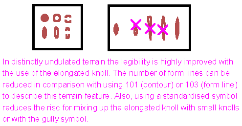
In typical Swedish terrain there is a large need for the use of an elongated knoll. This symbol was included in the specification for maps as a B symbol before 1990. Tries made to use form lined contours have proved to be less successful. In detailed terrain, the legibility is improved using the elongated knoll rather than the contour (101) or form line (103).
Small hut
There is a great disadvantage in using the symbol for building when showing small huts, for example hunting huts. There is a risk of confusing it to rocks, unless the symbol is heavily over-dimensioned. Therefore, we suggest that the hut is shown with a equilateral, unfilled triangle. As an alternative solution, the amount of local symbols could be increased.
Forest: difficult to run with great variations
There is a need to be able to show forest which is difficult to run in but with great variations. Thus, we suggest a new symbol with 20 percent screen with large white dots (see 404). The runnability should be equivalent to that of 406.
Symbols to be excluded
209 Boulder cluster
This symbol ought to be excluded because of the apparent confusion with boulder field. We suggest the use of boulder field (208) instead.
407 and 409 Undergrowth
These two symbols ought to be put together into one, since the legibility is extensively decreased when the two are being used. Also, tests have shown that mappers many times show too many green areas, especially areas with undergrowth decreasing the runnability.
540 Fodder rack
In order not to make worse the relation between orienteers and landowners/hunters, fodder racks ought not be shown on the map. In case there is an absolute need to show fodder racks, local symbols should be used.
Changed dimensions
101 Contour
Today's dimension, 0.125, should be increased, possibly to 0.14.
210 Stony ground
The dots should be increased to 0.20.
404 Rough open land with scattered trees
This symbol needs to be changed in order to increase legibility and avoid confusion with 402.
531 Ruin
The size should follow that of building (527).
310 Marsh and 311 Indistinct marsh
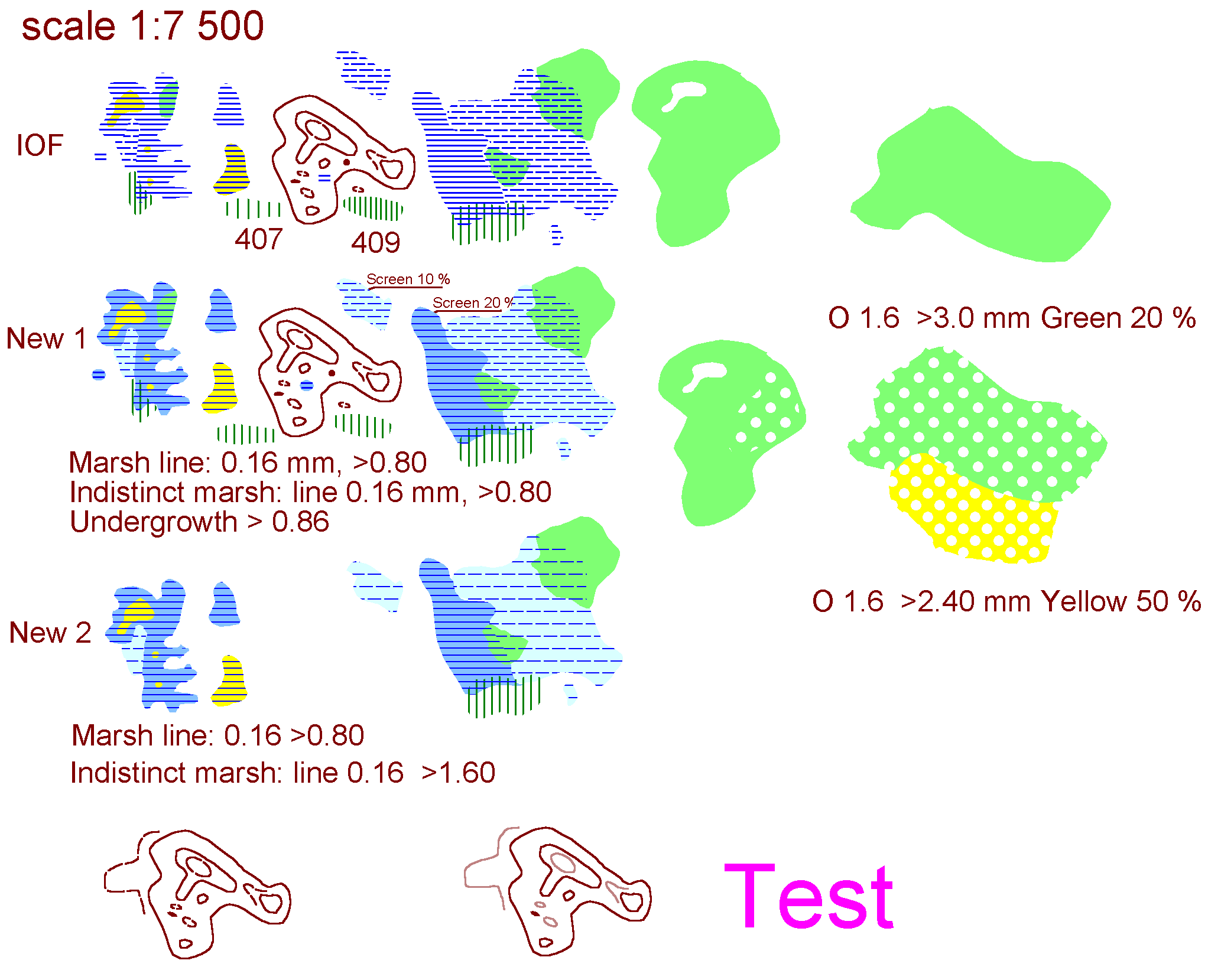
These symbols need a change in order to find a more adjusted solution so that also less obvious forms can be legible. We enclose some examples of tests made.
306 Crossable small watercourse
The dimension should be increased to 0.18 in order to easier distinguish between this symbol and 307.
308 Narrow marsh
The dots should be increased to 0.35.
518 Major power line
The line for the pylon should be increased to 0.28.
Windfalls
In a more ecologically focused forestry, windfallen trees may not be cleared away the way it is being done today. There will most certainly arise a need to show these areas on the map. One way could be to use the symbol for undergrowth and indicate the runnability direction as is being done in 411.
 Explanations:
Good cartography means legibility. Today the orienteering map standard contains a number of object with a bad "cartographic" language. Such objects includes dashed lines, hatched areas etc. The reason for this is of course the traditional methods of map making. When entering the world of computerised mapping, new opportunities open up, making it easier to achieve the high goals of legibility nescessary for modern orienteering. In order to further improve the legibility of the orienteering map, without too dramatically revolutionise the o-map language, Sweden suggest a stepwise approach. The traditional o-map language could thereby be improved and emphasised. The test above shows some of these ideas.
The MARSH object is a hatched area object. In situations were the marsh is outstretched in an east-west direction, the fine undulations of the marsh border is lost. This can however be improved, as the examples shows, by putting a thin blue raster under the hatches.
Sometimes the cartographer finds himself in a situation were the medium green has a lot of "runnable islands" within it. Today this situation is sometimes solved by the "gulash map" technique, something that creates an indistinct cartographic image. Sweden suggests the same approach for the 50% green as is used for the IOF 404 (open forest with scattered trees). This means there is not a new sign introduced, only that the 50% green raster could be combined with the white dots to constitue the "slow run with faster spaces" sign.
The form line is one of the worst signs in the ISOM when it comes to legibility. Maps with many (and short)
form lines are often very bad to read. On the other hand the form line is absolutely nescessary in order to fine
tune the topographic description of the terrain. Sweden suggest that the dashed form line is replaced by a
rasterised solid line, that makes the form line look "lighter" than the ordinary contour (101).
